As I mentioned in the release post for Enter Command, I’m trying to make a few more general-use pixel fonts, that have less of a unique personality so they’re appropriate for a wider range of applications. This time, it’s a general-use multi-weight serif pixel font!
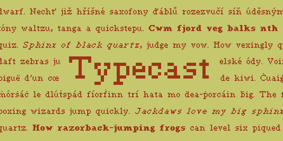
In the world of pixel fonts, it seems like sans serif is the standard (and most popular style) but there’s something very enjoyable about designing pixel serifs. Compared to some of my other serif pixel fonts, Typecast is smaller than Pixolde and also more old-style/transitional (despite the name, Pixolde is more of a geometric slab serif). Typecast is pretty similar in style to Microserif, but is a lot large (I mean, there’s not a lot that are smaller…).
I designed Typecast to have the same x-height, ascenders and descenders as Enter Command, so the two can be fairly interchangeable in projects. In other words, a kinda… Verdana/Georgia or Calibri/Cambria relationship. This is actually a pretty nice size to work with, and I have at least one more typeface at this size in progress!
Name-wise, I think Typecast is pretty obvious. This is just a respectable, standard version of a serif font–exactly what you’d expect. Stereotypical, but it gets the job done!


Interestingly enough, one of the toughest things about Typeface (aside from getting a workable italic, because pixel italics are truly tortuous to get looking right), was coming up with a name. Everything I could think of was either stupid, ill-fitting, or already taken by another font. Annoying!