Although I really like making fonts that have a unique personality, there’s still always a need for fonts that are a little more understated. And have multiple styles. Today is the first of several typefaces I’ve been working on for the past month or so, because pixel italics are useful and an absolute nightmare to create.
The name of this font (and the style of the uppercase roman characters) is partially based off of the font from Hi-Res Adventure #1: Mystery House, a 1980 On-line Systems game, before they became Sierra On-Line. This was one of the very first graphical adventure games (most everything before then was text-only).
Despite the addition of graphics, the gameplay was still very much text-based, and I thought that the overall size/proportions of the characters would make a very nice starting point for a multi-style font. Here’s a look at how the original looked anyway:


The font I created is not monospace, nor is it an exact copy of the font used in Mystery House. That wasn’t what I was going for!
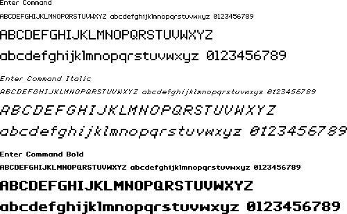
I used the general rounded-square letter proportions and extrapolated into a lowercase character set, then an italic, then a bold. The letters keep to a general maximum width to evoke the monospace feel.
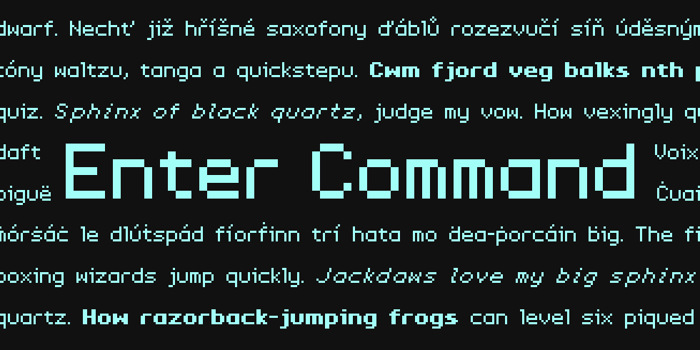
As always, it’s very tough to get a pixel italic where all the letters feel like they’re at the same slant, but I’m pretty satisfied with how this came out. Without further ado, here’s the basic alphabet + sample sentences:

As a final note, the original Mystery House game was released into the public domain in 1987. If you’re interested in experiencing one of the first graphical adventures for yourseslf, you can emulate Mystery House on archive.org.