
Today we have a special surprise — a double font release! I actually intended to bring this one out last month, but it was delayed for various reasons. My write-up post on the 2nd font in this double release (Enchanted Sword) will come tomorrow.
Now, about Squarewave itself… I actually was mid-process on a few more different designs, but decided to pause work on those to bring out another multi-style typeface, along the same letter size as my other recent multi-style typefaces: Enter Command and Typecast.
Pixel fonts are, by nature, somewhat limited in look, design, and usage. However I still think it’s interesting (and useful!) to create some fonts that have broader use by adding italic and bold options. Being able to add emphasis without relying on ALL CAPS can be pretty indispensable at times.
I’ve already made a 7px-tall fairly geometric multi-weight sans serif (Enter Command) and a nice traditional multi-weight serif (Typecast) so I’m venturing into more stylized territory this time with Squarewave.
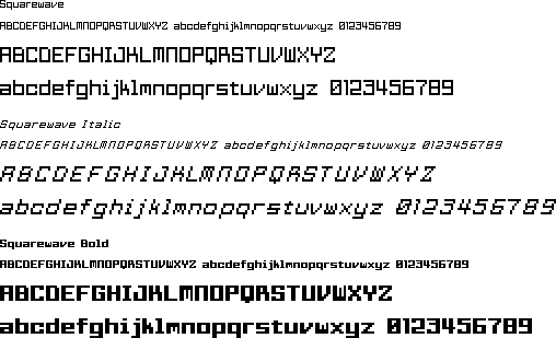

I took some inspiration from 7-segment displays (SSD) and 14-segment displays (FSD) you often see on digital clock interfaces and calculators with alphanumeric displays, but also deviated quite a bit to put together something that feels very digital but also somewhat unique, and lets you tell apart letters like uppercase I, lowercase l, and number 1. I also decided to play with the center segment on 2, 3 and 5 to make them very distinct and easy to tell apart from letters at a glance.
As usual, I started with the normal weight and then moved on to create italic and bold styles afterward. Usually I’m only happy with bold and satisfied with italic (oblique characters can be real torture to create in pixels) but actually, this time around… I think I like the bold weight even better than the normal weight! Some of the concessions I decided to make in order to not have certain letters end up way too wide in a heavier weight ended up giving the bold a lot more personality than I had originally intended (M, W) and even though they’re only 2 letters I think they really add a lot, so much so that I very nearly made the preview image for Squarewave use bold for the title, which is something I never thought I would have even considered before!
Of course, with the bold weight falling into place so harmoniously, the italic put up even more of a fight than usual… which is really saying something, considering that italics never ever cooperate when you’re working with pixels. Every time I attempt an italic style I gain ever more respect to Link’s Awakening (GB) for going with an italic-only typeface for all in-game dialogue. And it’s a nice one, too!
In the case of Squarewave, one of the reasons I ran into so much trouble was because I was going for very rigid, square letterforms, and diagonal lines in pixel fonts tend to produce optically rounded corners where they meet edges, really destroying the look. All in all, I’m pleased with how this came out, and excited to be able to release another multi-style font. That being said the next few designs I have in progress are not multi-style, and I’m pretty thankful for that.
can support Common Turkic Alphabet
Yes, all accented characters in common turkic alphabet are supported–and if any aren’t, you can let me know and I’ll make sure that’s changed in future fonts!