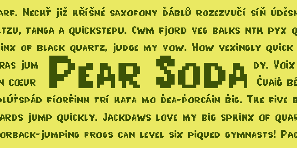
Here we go again, it’s the third font in my “Fruit Soda” series. This time around I’ve gone for small caps, like the first font I ever released, Litter Lover.
I’ve always been a fan of the look of small caps–there’s something very satisfying and balanced about the way the “lowercase” is a consistent height, without introducing the rhythm of ascenders and descenders (although I did stick a few descenders into this one). Capital letters have even more emphasis, since there are no lowercase letters that reach the full height. Small caps aren’t as aggressive or as stern as all caps. There’s a certain sense of elegance to them.
Originally I was toying with the idea of making this an alternate style for Grape Soda (it has a similar thick marker feel), but as the design progressed this font really ended up getting its own distinct voice.
Pear Soda does not feature the same higgledy-piggeldy alignment as my other two Soda fonts, but the chunky, cartoony, and slightly off-kilter letters keep things lighthearted. Feels a bit like comic book sound effects, right?


Fun fact: not really a huge fan of soda, honestly! I don’t particularly like carbonation and would almost always rather be drinking water or green tea (unsweetened).