
I’ve been releasing fonts at a fairly fast clip these past few months. This gives me more time to check & double check, test & retest, and generally make more polished final creations.
If I wanted to, I could just dump a bunch of font releases out at the same time–but by forcing myself to wait and take things slow, I have more time to really look at what I’ve made and decide if it’s actually ready for prime time.
The thing is, I often have multiple ideas at once and start following a few different threads. I can finish a full character set in a day and rush to release it, but sometimes it’s not until the next time you look at something you’ve created that you realize it’s just. Not. Good. (All the other creatives out there, you know what I’m talkin’ about!)
The point is: sometimes I know right away something isn’t going to work out. Sometimes I start designing and realize that this wasn’t what I had in mind at all. I’ve got a lot of half-baked designs saved, and today I’d like to spotlight a few that almost made it.
“broadpenroman” – I created a set of uppercase characters, was quite pleased with how things were turning out, and created a set of lowercase characters to go with them. Unfortunately, what you see above was what I came up with. The lowercase characters are real mess stylistically, with a way-too-modern “a,” top-heavy “g,” and a just plain ugly “v.”
In the end I realized that the uppercase and lowercase just aren’t meant to be part of the same font, and the more I worked on things the uglier the characters seemed to become. In the end I decided to start from scratch and produced Scriptorium (which I’m very happy with) but I still think I’ll take another crack at this mess… eventually.

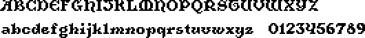
“german” – While exploring more pixel blackletter ideas, I decided to try to make something that had a smaller overall footprint than Alkhemikal and Fraktur-inspired letterforms. Once I finished the lowercase, however, I decided that the design was just too similar Alkhemikal and started from scratch, using Old English scripts. This resulted in Owre Kynge, which turned out very different from Alkhemikal (which was what I wanted)!
Looking back, though, I think I might have been a bit hasty rejecting this design. I’ll probably start from scratch again if I want to do something Fraktur-inspired, since this ended up being not as faithful as I’d like, but I think this attempt has some real potential.

“hyperion” – And now for something completely different! Not all of my aborted projects are calligraphic. I worked on this longer than any of the other two, and even created a good chunk of accented characters, punctuation, etc, but something just still rubs me the wrong way about the whole thing.
Angles like this are a real challenge when you’re working with so few pixels, and I don’t think I was quite successful. The character spacing, the the visually-mismatched tilt of many characters (compare the angle of the 0 & 1 or 3 & 4, yikes) and some downright ugly letterforms (capital V) made me keep going back and redoing things, and at this point I’m just sick of fiddling with this one.
These three attempts are all salvageable (to varying degrees) and I’d like to revisit them sometime… but for now, they’ll remain in the graveyard of abandoned fonts.
Photo by chuttersnap on Unsplash