Something a little different today–instead of a new font release, I’m going to be taking a closer look at a existing font! Today I’m featuring the font from Skitchin’, a 1994 Sega Genesis game. “Skitching” is the act of hitching (a ride on) a vehicle by grabbing onto the rear bumper while skating (or skateboarding). Skating + hitching = skitching. Now you know!
The very first thing you see when you start up the game is a big ol’ warning about how actually skitching in real life is dangerous. Already on this screen we’re getting a very nice character sample–only a few letters are missing! There are two sets of letters: small caps and large caps, with a slightly-distressed grunge feel. Overall it’s got some pretty nice attitude!
That being said, there are definitely some things that could have been handled better. For one thing, there are several “uppercase” letters that let things down by being too normal, like the uppercase B, I, H, and U (B is not in the above screenshots). Doesn’t that U stick out like a sore thumb? The uppercase O as well… it has some pretty weird line weight and a very square center, which is especially strange when you compare it with the appropriately asymmetrical lowercase o.
Another issue: the letter spacing. As with pretty much all retro video game fonts, this is a monospace affair, which means each letter is allotted the same amount of horizontal space regardless of width. (In this case: 8 pixels, which is pretty much the de facto standard). Whoever designed this font doesn’t seem to have taken this into account, unfortunately. Normally with monospace fonts you should position slimmer letters closer to the center of their available space, to even out spacing.
Note the awkward extra room to the right of each c and i (and their uppercase counterparts), the biggest offenders in the images above. Pay attention to the poor spacing in “Vancouver” and “Kilometers.”
So far I’ve only really discussed the letters, but we’ve got numbers as well! Strangely enough, there seem to be two different sets of numbers in the game. The weirdest thing about it is you might expect that maybe one set of numbers is the height of the uppercase letters and one is the height of the lowercase–but nope, both sets of numbers are the exact same height. What’s the point?
The shop is the easiest place to see both sets of numbers at play at once. Where your money is listed we see the same numbers we’ve seen on the title screen, the cutscenes (where the distance of the next round is shown), the screen that shows your current password (but not the password entry screen), and the post-round stats screen. Then in the bottom right corner we see a different set of numbers, complete with a different dollar sign!
The first set of numbers (that appears more often) is spaced better, but it’s also much more generic. The second set of numbers (and dollar sign) are more in line with the style of the letters, design-wise. In the second shop screenshot above you can see the two different versions of “$100”. Take a look at that huge gap after the 1 in the second set of numbers! It feels like two different people designed the two different sets of numbers. The question is, why use both?
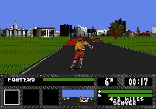
Finally, we see the interface during gameplay. In this interface we exclusively see the second set of numbers. The distance remaining (and any numbers in the player’s name, if numbers were entered) are all the same numbers that show up in the shop prices. The player’s position + time elapsed are these same numbers, stretched vertically (pay attention to the 0, 1 and 2 shown above).
Curiously enough the gameplay interface also features a completely different uppercase I than what we see anywhere else: one without crossbars! You can see it in the word MILES in the third gameplay screenshot. This crossbar-less I also appears in the character names in the UI, if the characters have an I in their name (I could not stand to play this game long enough to get a good screenshot of SPLINK or RABID showing up).
Just like with the two sets of numbers I have to wonder: what was the point?
Anyway, here’s the full alphabet that appears in the game, plus both sets of numbers (and dollar signs):


If you’re interested in checking out the game in action, you can emulate Skitchin’ on archive.org (how I recorded the shots above) or you can watch a TAS of Skitchin’ on TASVideos. If you’re especially curious about the game, you can find scans of the Skitchin’ manual on Sega Retro.


