Do you remember the 90s? I guess it depends on how old you are/how much of the 90s you were alive during. Considering that it’s possible for someone to be 18 years old, reading this, and born after the 90s are over… yikes! I’m old!
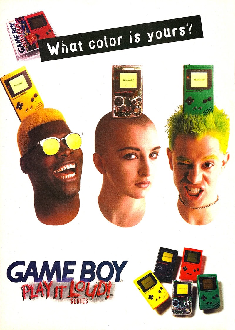
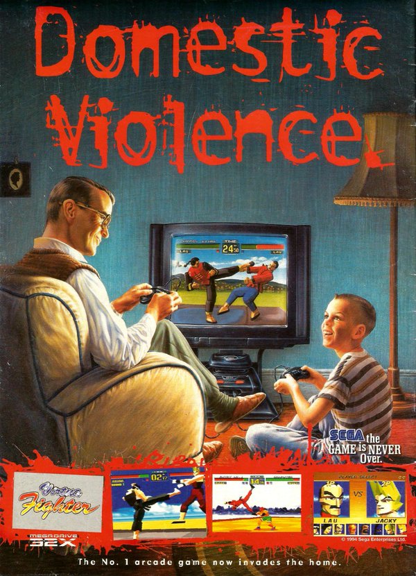
Back on topic: my latest font, Unbalanced, is inspired by the totally edgy ads of the 90s, specifically ads for games. Not any specific ad, just the attitude of game ads in general.
I tried to search for images of the kinds of ads I was thinking about when designing this font, but honestly couldn’t really find much! My concept was: 90s attitude, cyberspace, and distortion.
These images are the closes I could find to what I envisioned:
On the other hand, I guess the fact that I couldn’t find anything is nice–shows that I went for the concept w/o basing it on anything specific!


Enjoy!

