
I don’t think it would be unreasonable to assume that when the average person wants to create their own font, it’s in order to have a font of their own handwriting. There are tons of programs and online generators devoted to this very thing: making it easy for your average person to create their own handwriting fonts! Even I’ve tried out some of these tools, and created a few. (Yes, I have made things other than pixel fonts–go figure!)
Strangely enough, though, every handwriting font I’ve ever developed wasn’t really my handwriting. Instead of just working with my natural handwriting, I developed character sets that were nicer, neater, more cohesive, more designed than the sprawling chicken scratch that is my real handwriting.
After several failed attempts at an Art Nouveau-inspired font I decided to switch gears entirely and revisit the “your own handwriting as a font” concept, but still keeping myself to the restriction of a miniature pixel grid. It’s been a while since I’d last examined my own handwriting so closely, so it was a very fun exercise in translating loose, natural letterforms into the inflexible grid of a pixel font.
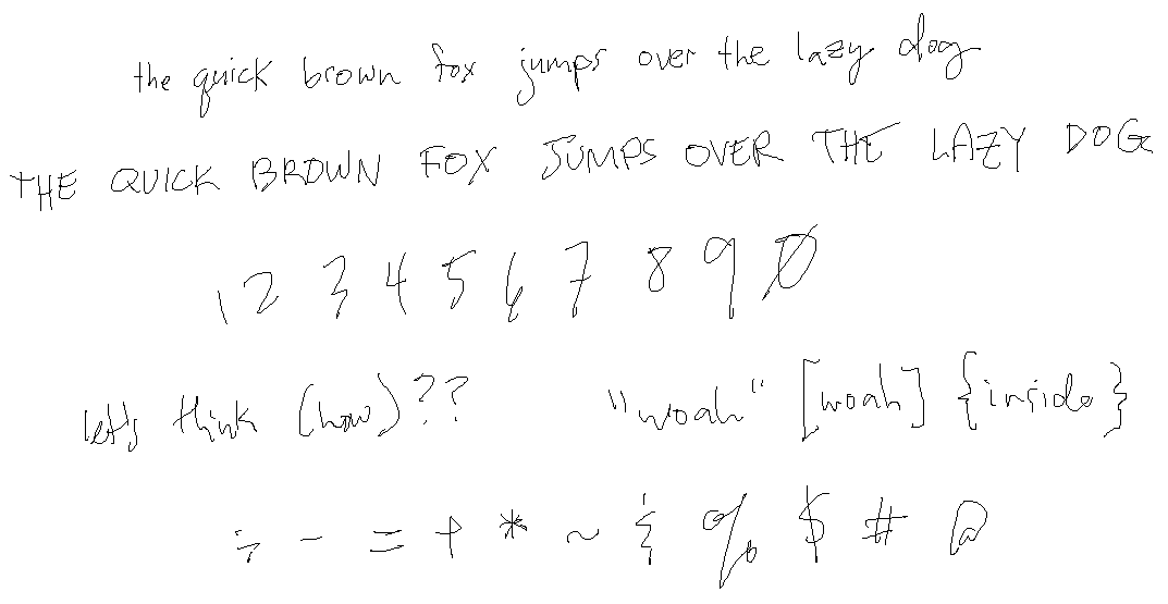
One of the most important parts of creating a font based on your handwriting is to make sure you’re not overthinking how you write. It’s only natural if you let your hand write how it wants, instead of getting self-conscious and letting your brain beautify individual characters. To anyone making a handwriting font of your own: I recommend writing out several pangrams multiple times over instead of jumping straight into “AaBbCcDdEe” since writing sentences will let you get closer to how you’d write things if you weren’t thinking about turning it into a font. Here’s one of the first samples I put together of my own writing to work off of:
(Yes, I put together this writing sample in Microsoft Paint. Why not?)
The toughest things to come to grips with, aside from the obvious (creating a font that kept the same rhythm of my writing) was keeping the x-height very, very low. It’s not easy to keep a low x-height in pixel fonts, where you already have very limited room to work with if you want things to be legible when you’re done!
I also had to reign myself in a bit when it came to letters that I’d normally overlap/connect, since I wanted to make sure the font was usable in all situations, not tailored to specific words. This means that characters like lowercase y and g, that I normally include a large loop on when at the ends of words, were simplified so that things didn’t look terrible when they appeared in the middle. I considered for a while including custom ligatures but in the end I decided I wanted to make all letter pairs look good on their own, without needing any extra help.
Without further ado, here’s the base character set + pangram samples in a few languages:


One cool thing I did with this font (that made it a much larger undertaking than normal) was that every single character was hand-drawn to be unique–including all accented characters! Whereas normally I’d create the alphabet and then duplicate each letter to add accents, for Notepen I decided to draw each accented character fresh, to add more variety for languages that use a lot of accented characters.
In the sample above, compare how each lowercase “e” looks across the different pangrams. For instance, the word “préfère” in the 4th sample sentence contains 3 different versions of the lowercase e: é, è and e! It may be a tiny detail, but I think it really adds a lot.
Notepen is very unique when it comes to pixel fonts, so I can see it easily being used to add a more personal touch to art, and of course it would work great in games with “notes” or a hand-drawn aesthetic. As always, let me know if you use this in a project!