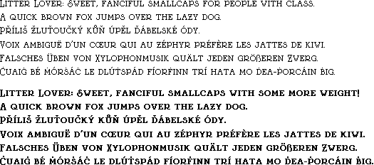
The first font I ever released, but the last to be updated! This update was quite an undertaking, mostly because I kept flip-flopping back and forth how I wanted to go about it.
In the end, I realized that the changes I was making were taking the font too far away from its origins, and switched gears to do a smaller cleanup of the original while also releasing an alternate uppercase set.
Due to the nature of this revision having an alternate character set, it would take forever to pull out every individual letter–instead I’ll just cover the whole alphabet at once.

Lowercase: Not a lot changed with the lowercase characters, but there are some definite differences. The strangely emaciated D receives a more fitting round belly (along the lines of over round characters, like O). M and U also get a little more breathing room, working better proportionally with the rest of the letters. Conversely, V & W slim down one pixel to be slightly less blocky.

Uppercase (Both): Here come the big changes! One thing that might not be readily apparent is the fact that the capital letters drop down one pixel, which I think gives things a refined, pseudo-dropcap look.
Uppercase (Revision): The overall concept of the original font was to have tall, slim capitals (with the exception of S) so I decided to actually follow my own internal rules better this time around. All in all every capital (except S) changed to become exactly as wide as their lowercase counterparts. This means that capitals D and U got wider to match, but otherwise most letters slimmed down. M, V and W get one pixel slimmer P & R lose a lot of roundness. The aforementioned S, which was previously a whopping 3 pixels wider than the lowercase S (pretty substantial for a tiny font like this!) has become only a single pixel wider. Still breaking the rules, but to a lesser extent!
Uppercase (Alternate): Rather than keeping everything slim, I instead made the capitals all wider than their lowercase counterparts, making it so that the proportions match more closely. The S is still not as wide as the original version, but I think it looks a bit more balanced like this while still being quite distinctive.

Other: Did anything else change? Of course it did! Most notably, the percentage sign (not shown). For some reason I neglected to get images of anything but the numbers. The 5 is different. Did you even notice before I mentioned it?


Besides all the changes mentioned above, I’ve added around 240 accented characters, as well as a bold style for both versions. It’s nice to finally clean up something I made almost 11 years ago, especially since I dropped the ball badly when it came to setting a reasonable line height.
Why is it called Litter Lover? Well, I originally wanted to call it Little Lover (Little because it’s a tiny pixel font, Lover because I thought that word looked nice in the font) but testing it out involved me typing the words “Little Lover” out so many times that the phrase began to disturb me… and so at the last second I changed the name to Litter Lover, released it onto the internet, and never looked back.